Look, I know, it’s been discussed to death, and already reasonably explained, but I haven’t updated this site in a while and I want to add my own two cents into this whole The Dress thing. Partly, it’s because I’m a photographer, and as such, I feel like I should have an above average sensitivity to color (I almost had a perfect score on X-Rite’s Color Challenge; impressive for a male—there’s a reason why so many male photographers, like Leonard Nimoy, prefer to shoot in black and white.) Yet when I first looked at the picture of The Dress, I saw (mostly) white and gold (now proven to be wrong). When I looked more closely, I saw a very light lavender and gold. I could understand how people were seeing blue, but for the life of me, I couldn’t figure out where they were getting black.
http://www.wired.com/wp-content/uploads/2015/02/Untitled-12.jpg
A simple white balance correction (as in the photo above from Wired) still wasn’t enough for me. Yes, there’s the blue, but it’s nowhere near the actual blue of The Dress. Furthermore, the “black” is certainly not black. It’s a dark brown, at best. What I finally considered is that the error in the original image was not simply in the white balance, but in the exposure as a whole. I decided to run my own color correction pass on the original file (which, being a very low grade JPEG, was not perfect). I adjusted white balance, lowered exposure by about 2/3 of a stop, raised the black point, increased the highlights to regain the pure white that was lost in the background as a result of the exposure adjustment, adjusted the curves to increase contrast (which seems contradictory given the high contrast in the original scene), and finally messed around with a levels adjustment to bring the mid-tones closer to black. None of this would have been necessary if the picture had simply been taken by an accomplished photographer, like Leonard Nimoy. The result is below.
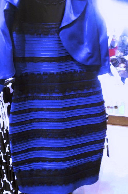
While the colors in this edit more closely match the colors of the actual dress, the image data doesn’t exactly hold up well and there are plenty of processing errors: what’s going on with the floor, and those “potion bottles” in the background? Also, the lace still isn’t black, but it’s much closer. I think what was really throwing off people like me in the original image is how specular the fabric is; it almost looks like a wet plastic the way it’s reacting to the light.
So who is right and who is wrong? Well, yes, the real dress is blue and black—but looking at the RGB color values of the original photo reveals the actual colors of the pixels are more of a lavender and brown/gold (the “black” is roughly 46% red, 42% green, and 29% blue with about 40% luminosity. Actual black should have the same percentages in all colors, and should definitely have a luminosity lower than 40%). So in short, everyone is both right and wrong. It’s a sort of rational paradox that only experienced photographers who have played Vulcan characters on Star Trek could understand, like Leonard Nimoy. It seems that some people are filtering out the effects of the incorrect exposure, white balance, and bizarre specularity of the fabric and are able to see the true colors of the dress, whereas other people (like myself) are simply seeing the colors as the camera captured them—they may be unrealistic colors, but we are correctly seeing what is shown.
So what does this all mean? I have no idea. I would be curious, I guess, if people who saw blue and black right away also don’t perceive the effects of creative lighting/coloring to the same degree as those of us who were “wrong” about The Dress. If your brain is filtering out the effects of light color and always showing the actual colors of things, maybe you are blissfully unaware of the overuse of orange and blue in cinema.
Or maybe I am just wasting my Friday night talking about this. Let’s go get a beer. Live long and prosper.
I saw the dress both ways, depending on lighting in my office. First, during the day, I saw the correct blue/black colors, and at night with a warm-colored lamplight on, I saw gold and white. I think it’s a combination of bad exposure, ambient light, and context. This is one of the reasons that we photo retouchers like to see the product. Sometimes it’s impossible to tell from the image if we’re looking at a light grey shoe or a white one – the numbers don’t necessarily tell you, and it can look either way depending on context. Avoiding bad exposures like this dress are also the reason people hire pro photographers to take pictures of the product.
Cool read. I also liked the link you put up about color in cinema. I see white and gold…
I hadn’t heard anything about “The Dress” until Jimmy Fallen talked about it on TV tonight. Then I saw your post. One of his band members said he saw a white and gold dress, until he dropped his phone and saw the image upside down, when it then looked blue and black. Must have ben catching different lighting. our article is very interesting, though I must admit as a non-photographer, some of it went over my head.
BTW, how was Arizona?
Love you lots, Mom